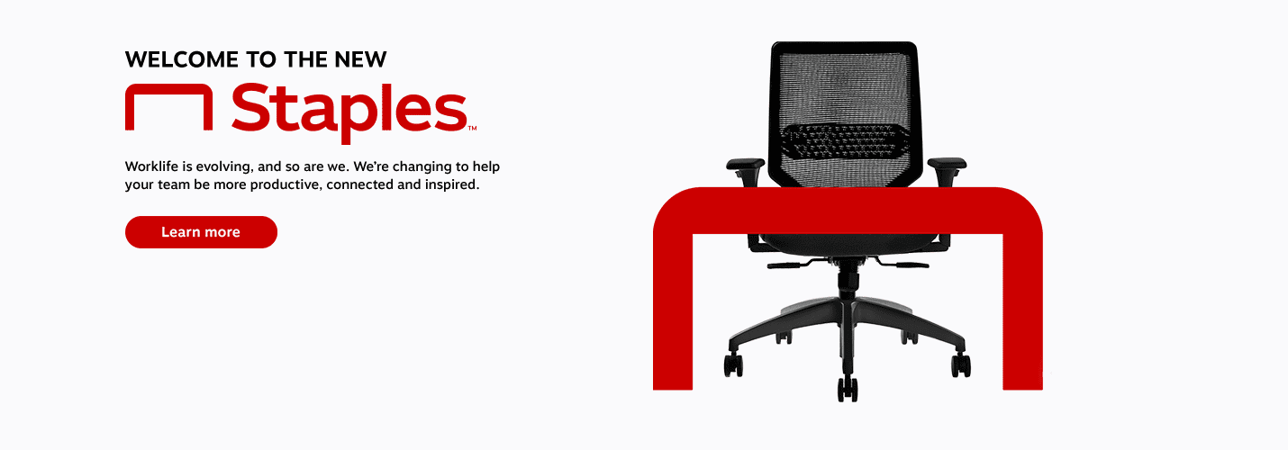
It feels like every day another company announces a rebrand. Whether large or small, global or local, established or fresh on the block – a rebrand presents a massive opportunity for any company to drive business results when done correctly. When news broke that Staples had rebranded, we held our breath and dove in to see which side of the rebrand launch spectrum they would land in: the one to avoid or the one to learn from.
Though at first reaction some may say their new logo reveal was “anticlimactic,” (Hi, Jason!) this comes at a critical time for Staples, who like many other brick and mortar retailers, must evolve and adapt to compete in today’s Amazon era.

While a new visual identity alone isn’t going to save them, its launch does serve as a moment in time for all eyes – the industry’s, their employees’, and most importantly, their consumers’ – to be on them to announce what’s next and why people should continue to believe in them as a solution to their needs.
In this case Staples has risen to the occasion. Below are three things all marketers should keep in mind when planning a rebrand launch:
1. Focus on a business objective
Whether it’s a change in company vision, needing to attract a different audience, or having to navigate brand perception issues, a rebrand should have one clear objective that the entire strategy revolves around.
After their failed 2016 merger with Office Depot, Staples is taking a B2B2C approach in shifting their focus to business consumers while still speaking to the end consumer. Their new positioning as “The Worklife Fullfilment Company” centers around helping businesses of all sizes create dynamic and productive work environments for their teams. This shift comes at a perfect time when the fight for professional talent is at an all-time high and professionals are looking for employers who will help them build a career fueled by purpose.
2. Clearly communicate what’s different
Most people outside of a company won’t care about a new logo or color palette. As a creative who obsesses over these details and spends hours crafting visual narratives that align to an overall brand strategy, this breaks my heart. However, understanding that a refreshed visual identity is the door-opening piece of a larger brand puzzle is key. Use it to excite and reinvigorate internal audiences, grab external audiences’ attention, and then clearly communicate what else has changed.
Aside from their new look, Staples announced a major upgrade to their entire business customer experience. From a revamped digital experience to new product solutions, each element clearly connected back to their new vision. Perhaps the most interesting announcement was the introduction of five new product lines each with their own design-forward brands a-la Target, each focused on solving a specific audience need: from supplies, to tech services, to furniture.
3. Make a big deal out of it
Companies only get one shot to launch a new brand and reap all the potential benefits associated with that moment in time. The key is making a big deal out of it. Consider every possible touchpoint both internal and external and how it can be used to make employees, partners, and customers believers.
While the internet initially had a good laugh at Staples’ larger-than-life internal brand reveal video, it is clear that the people in that room felt like a big f*ing deal… Now that’s one way to get teams to drink the rebrand Koolaid!
So, what’s your take on Staples’ rebrand? Tweet me at @mromja and follow us @hotwireglobal.
